Learning Photography From Design Books: Composition and Color Skills No New Lens Can Buy
Most photographers spend their money in the wrong order. A new body, then a faster lens, then another lens. The pictures get sharper and cleaner. They don’t get much better. What changes a photograph is where things sit in the frame and how the colors work together, and that’s a skill you learn from looking, not from buying.
Some of the best teachers for it aren’t photography books at all. They’re graphic design books.
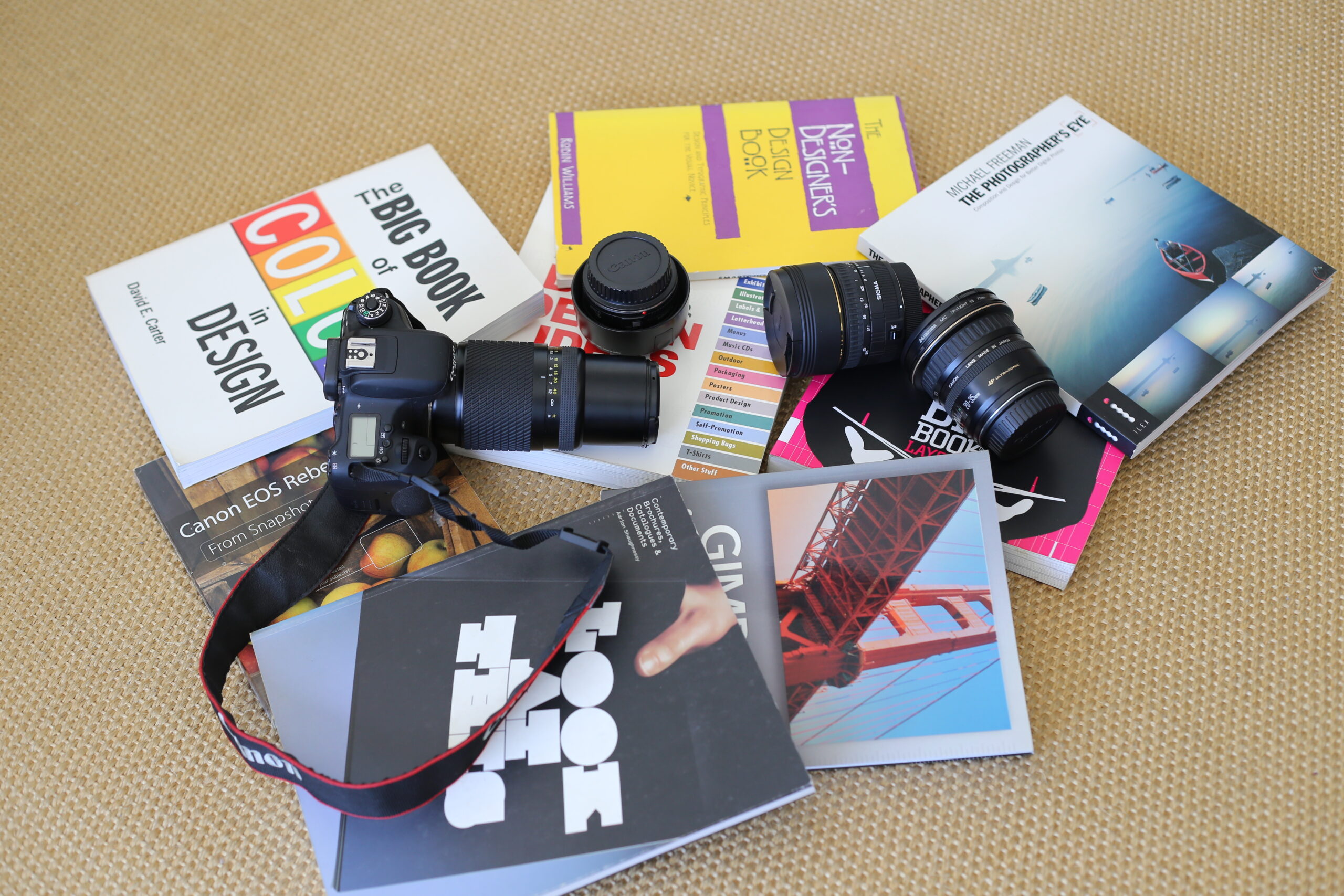
The flat lay below mixes the two worlds: a camera and a handful of lenses scattered across books on color, layout and type, with one photography classic among them. It’s a fair picture of how a lot of photographers actually learn.
Why design books help photographers
A designer arranges type, pictures and empty space on a page so the eye moves where they want it to. A photographer does the same thing inside a frame. The tools differ. The rules are the same.
Design books teach those rules plainly, because their readers don’t have a camera to hide behind. They talk about alignment, contrast, repetition and proximity, grouping things that belong together. Once you’ve seen those ideas on a page, you start seeing them in a street scene or a portrait background.
Robin Williams’ The Non-Designer’s Design Book, one of the books in the photo, is a good place to start. It’s short, it’s aimed at beginners, and every idea in it carries straight into photography.
Color is a learnable skill
Many photographers treat color as something the camera decides. Designers treat it as a choice. A book on color in design shows how complementary colors make each other stronger, how a single warm accent stands out in a cool scene, and why a frame with too many saturated colors looks noisy.
Try one exercise. Spend a week only photographing scenes with one strong color against neutrals: a red door in a grey street, a yellow coat in fog. Your eye will start finding them everywhere. It costs nothing.
If you shoot Fujifilm, the film simulations on a camera like the X-T50 are a good way to explore this, because each one handles color differently straight out of the camera.
Then read a photography book about seeing
Michael Freeman’s The Photographer’s Eye, also in the photo, does for photography what design books do for pages. It deals with frame shape, balance, lines, and how the eye moves through a picture. There are no camera settings in it worth worrying about. That’s the point.
Read a chapter, then go out with one lens and one idea. A cheap prime is perfect for this. With no zoom, you have to move your feet and think about the frame. Our guide to the TTArtisan 50mm f/1.2 on Canon covers a lens that costs about $100 and makes you slow down.
Spend in the right order
The lenses in the photo are a reminder that gear piles up. The books are what changed the pictures. If you’ve bought a camera in the last year and feel stuck, buy two books before you buy another lens.